
There are numerous design decisions that need to be made to create a successful bathroom space. Some choices, admittedly, are more enjoyable and gratifying to make than others.
For many designers, helping clients select tile is one decision that often falls into the ‘more pleasant’ category. Considering its transformational capabilities and nearly limitless options that influence both form and function, tile can accomplish just about anything…from dramatic to dreamy or colorful to classic and everything in between.
This month, designers share projects that showcase tile at its most transformational.
BE BOLD
As a main component of a bathroom, tile is often also a focal point for many of Model Remodel’s clients.
“Between shower and floor tile, people really have an opportunity to make a big impact in a bathroom,” says Emma Mindel, marketing specialist at Model Remodel in Seattle, WA. “Tile selection is a favorite part of the design process for homeowners because it’s so tangible, and with so many different options available, there’s a size, shape and color for any desired look. A bold selection can make a bathroom feel special with colorful or three-dimensional tile, or for those who want a softer palette, there are more classic choices. Tile can certainly create very distinctive moods and it can be super fun to work into a design.”
As of late, designers have seen their clients embrace more colorful tile, often in shades of blues and greens that are reminiscent of nature. Patterned tile and geometric shapes, especially hexagons, are trending as well.
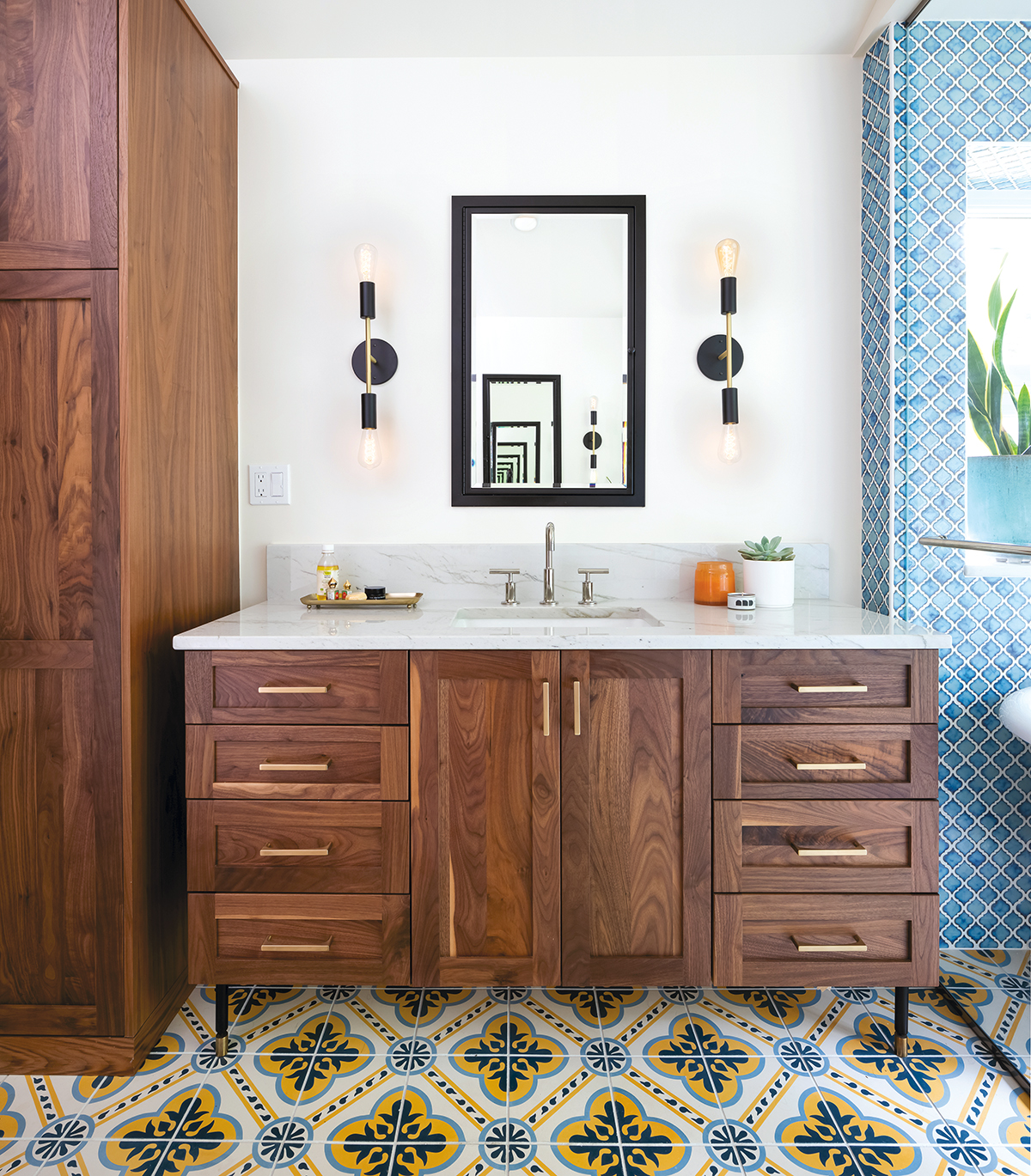
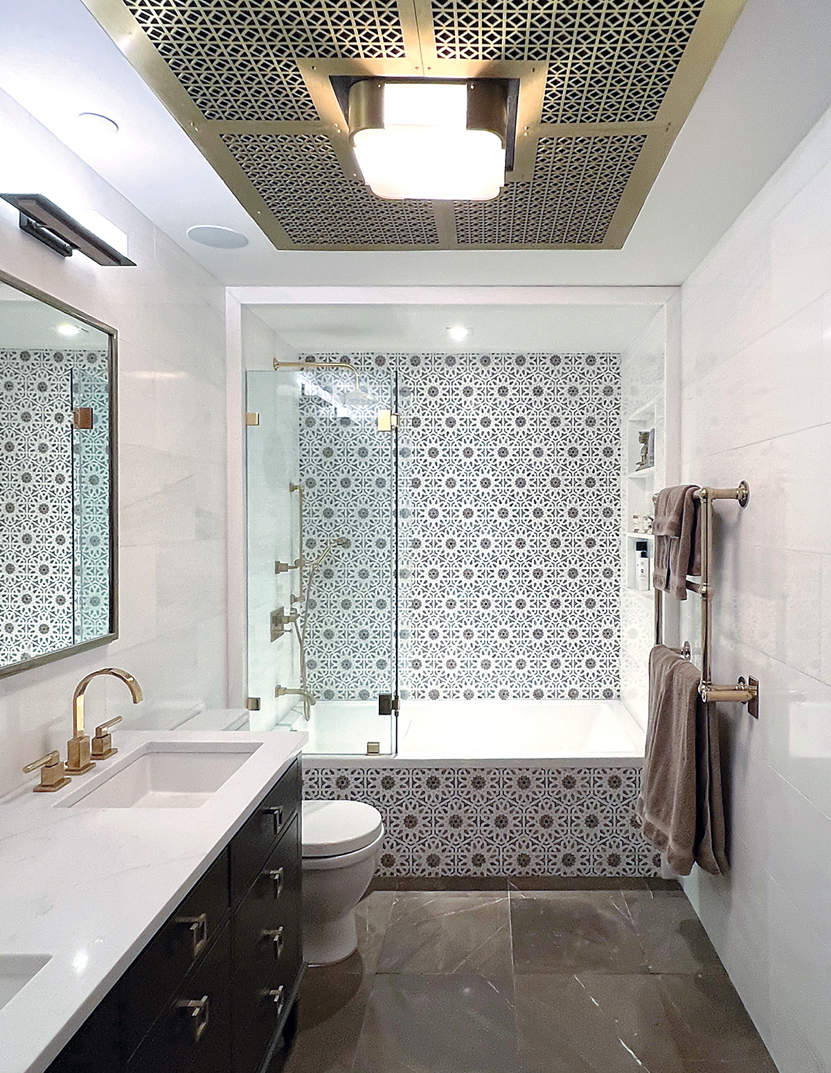
Both color and pattern are showcased in this primary bath where the new addition, built as part of a whole home renovation, is one of several spaces where bold tile selections were influenced by the homeowners’ travels to the Mediterranean and Middle East. Hints of the Pacific Northwest and Mid-Century Modern design, characterized by the walnut vanity, oversized windows and matte black finishes, complement the room as well.
On the wet room walls, SomerTile’s Hudson Tangier porcelain mosaic tile in Frost Blue offers a modern take on a classic lantern shape with soft curves and points in gradient shades of its color’s namesake.
“Our clients love its Mediterranean vibe, and it pairs nicely with the patterned floor tile,” Mindel explains, noting that its porcelain composition also makes it easy to maintain in the wet environment that includes a steam shower and vintage-style freestanding tub. “Tile installation, especially with unique shapes, is important, too. Having a skilled tile setter who continued the pattern around the corners is a small detail that is impactful to the design.”
The Cement Tile Shop’s Algeria encaustic cement tile clads the entire floor – extending from the wet room to the water closet – with an interlocking pattern that combines navy, white, crema and sky blue.
“We love the bright complementary colors, especially the gold (crema) that pairs nicely with the claw foot tub and the sky blue that matches the wall,” she continues. “Since the tile is cement, which is something we normally wouldn’t include in a bathroom, we sealed it with multiple coats of sealant for durability and use in the shower.”
CLASSIC TURNED MODERN
Checkerboard floors have been popular at various times throughout history, with early versions dating back to ancient Egypt and the Victorian era. A little more recently, they made a comeback in the Roaring Twenties, then again in the 1950s. Emily Moss, principal designer/owner of Emily Moss Design in Anna Maria, FL, has noticed renewed interest in the striking dark/light coordinated combination.
In this primary bathroom, the designer adapted the look, giving it a modern twist with black, brown and white Marazzi Classentino marble-look porcelain 12″x12″ tile cut into triangles.
Overall, her clients both agreed that they wanted a masculine aesthetic. However, she has a preference for traditional design while he favors a more modern look and wanted something unique for the space.
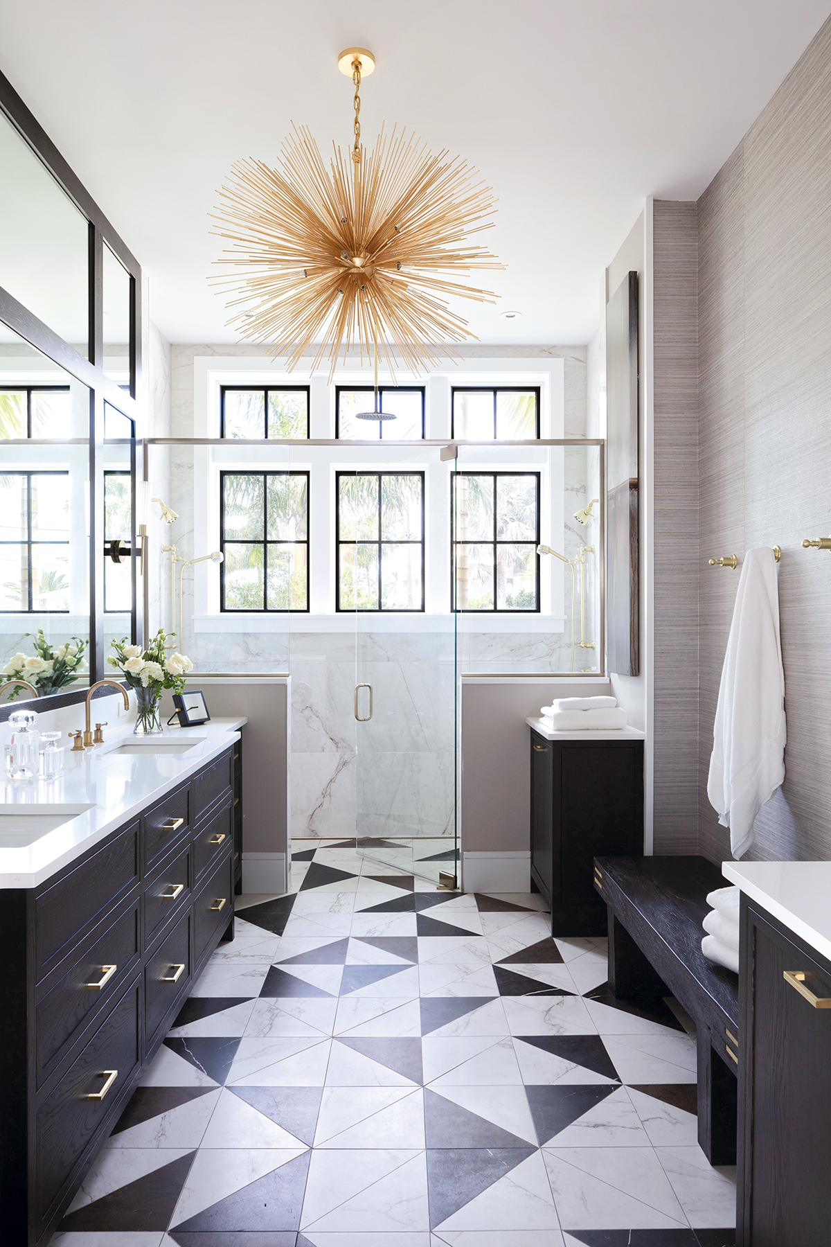
“Her style is very traditional,” she explains. “By using tile that looks like marble we could meet the wife’s request. If we would have used flat colors, the design might have been too modern for her. Also, adding in the brown tile adds warmth. Black and white offers great contrast, but sometimes they can feel too cool and harsh against each other.”
As well, choosing marble-look porcelain, rather than its inspirational natural stone, minimizes maintenance, which was important to these clients.
“People do want practical materials, so we’re seeing more porcelain and ceramic versions of luxury natural stone, like onyx, slate and bold marbles that can still give them a high-end look,” the designer adds.
Cutting the tile into triangles adds a funky twist and speaks to the husband’s desire for something modern and distinctive. However, Moss wasn’t able to actually find the tile in the desired shape and colors so she had her installer cut it into the preferred pieces.
“I spent three days with the guys on site, turning the tiles this way and that way, placing them randomly so it didn’t create too much of a pattern overall,” she recalls. “It was very labor intensive and hands on, but fun as well.”
Extending the floor tiles throughout the entirety of the space without any interruptions visually expands the space and carries the eye from the entry door to the window wall in the his/her shower where 24″x48″ white Marazzi Classentino tile sheaths the walls from floor to ceiling.
“The larger tiles create fewer transitions on the walls, which makes a nicer visual,” she says, adding that oversized tiles are still trending, as are colored tile, especially blues and greens; geometric tile like hexagons, and textured tile with everything from a linen to plaster look.
“Tile, in general, is a great way to add a durable surface and incorporate design into a space,” Moss continues. “And, it adds so much…color, texture, depth and dimension.”
CREATING A CUSTOM LOOK
With so many options available, including custom opportunities that allow for a more adventurous creation of unique patterns, layouts and color combinations, sourcing tile for a bathroom is one of Zuzana Ozel’s favorite parts of a design.
“Colors, shapes and textures can completely change the mood and feeling of any given space,” reasons the Rocklin, CA-based designer.
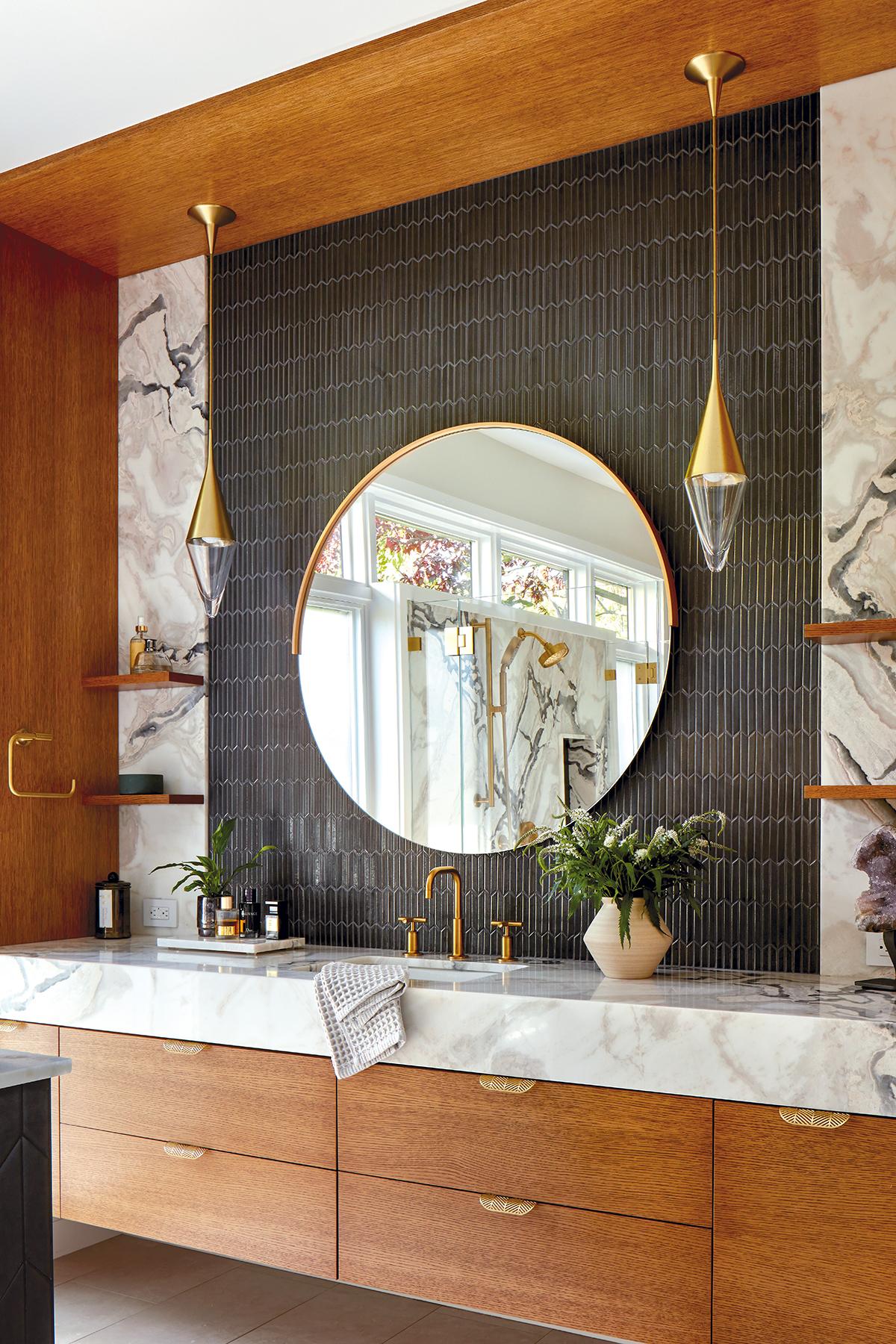
With that thought in mind, tile selection for this primary bathroom, which was part of a new-build home for the owners of design/build firm EBCON Corporation where she worked at the time of construction, focused on including touches of classic art deco style with a rich color scheme for the wife and elements of contemporary and industrial style for the husband.
To appeal to the wife, Ozel suggested Solistone’s Shebu Japanese glazed porcelain mosaic tile behind the vanities.
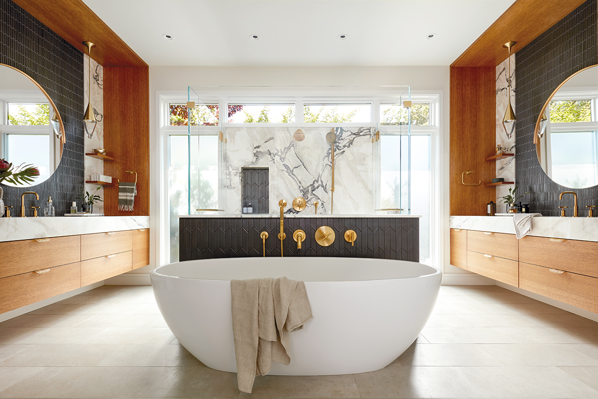
“The chevron pattern in various forms is one of the typical shapes representing the art deco style,” says the designer. “In recent years, you can also commonly find chevrons in more contemporary design applications where a variation with a straight, long edge looks clean and pleasing to the eye.”
The tile’s metallic finish also suits the husband’s request for an industrial vibe. While Ozel wanted to repeat it on the pony wall behind the tub and in the shower niche, its dry location recommendation necessitated that she custom order Encore’s 2″x6″ Chevron tile in Iron as a close match.
“It’s a little wider and not quite as elongated, but it creates a nice contemporary twist on a chevron,” she says.
The shadowy hue of both tile choices complements the dark, blue-gray veins in the marble used on the shower wall, as the countertops for the rift oak vanities, as backsplash accents and as the cap for the pony wall.
“The dark tiles also bring in the perfect amount of texture and contrast with the brushed brass plumbing fixtures and round vanity mirrors,” she adds.
Ozel purposefully kept the floor tile selection low key, choosing 12″x24″ Silver tiles from Emser Tile’s Network Series.
“Using simple porcelain tile in a neutral color tone provides a soft and warm understated look that allows the other rich selections to stand out,” she explains. “Large-scale tiles are also easier to clean considering there is less grout and they provide a seamless transition to the curbless shower space.”
As Ozel looks towards new projects, she appreciates that cooler gray tones are being replaced with warmer, creamy earth tones, and even old-fashioned pink. She also sees matte and textural surfaces winning out over glossy tiles to provide a muted, cozy and timeless look.
“And next to classic subway rectangles and other geometric shapes, I’m seeing more fun elongated scalloped shapes that I am dying to use in one of my upcoming design projects!” she adds.
MAKE A STATEMENT
Given its showy accent wall and marble emphasis, Alan Berman’s personal primary bathroom is representative of much of the work he does as an architect in New York City.
“I’m a big believer in accent walls that make a statement,” says the owner/president of Archetype Architecture in New York, NY. “If you wrap all of the walls in something boring, it does nothing for the space. If you wrap all of the walls in something crazy and loud, it’s too much. So, my theory of design is to make one of the walls special and make all of the others more muted to play up the tile. Usually, that wall is the one you see when you first walk into a room. In my bathroom, it’s the back of the shower and the tub face, which I built in a little with a ’frame’ to set off the mosaic. That’s what I call the ‘money shot’…the one that is special and bold.”
Berman also chose to clad all the walls, as well as the floor, entirely in marble.
“My house was built in 1891,” he relates. “I wanted to include marble because it is something that would have been in the bathroom at that time. I also wanted to have mosaic because there is mosaic tile in the front entry and in the huge kitchen downstairs.”
The walls, large-format 12″x24″ polished Bianco Dolomite marble from Nemo Tile & Stone, serve as a ‘quiet’ creamy white foundation. The mosaic and floor tiles, featured in a color palette Berman likes to work within, are from Walker Zanger. The former, Cafe Granada from the company’s Villa d Oro Collection, highlights Moorish Spain, Venetian Gothic and Medieval Egyptian influences in hues that range from creamy white to match the walls and accents of beige and black to make the statement. The floor tile, 18″x18″ honed Cafe Bruno, adds a richness in luxurious shades of brown that balance the warm, gold-tone metal grill ceiling accent.
Marble is often a material of choice for many bathrooms the firm designs, adds Colleen Slattery, senior interior designer.
“We haven’t necessarily seen any trends or specific requests for tile from our clients, but marble is always classic across the board,” she says. “Most of our clients play it relatively safe and we don’t get too crazy with color. If we do add color, it might be with tile behind the vanity or on a feature wall, but most of our designs are a little more subdued.”
WARM AND WHIMSICAL
Hygge is a term Kaitlyn Wolfe uses to describe the design of this primary bathroom, where the concept of coziness and comfortable conviviality engender a feeling of contentment.
“Our clients craved a home that felt comfortable, cheerful, whimsical and bright,” says the owner/principal designer of Iconic by Kaitlyn Wolfe in Scottsdale, AZ. “They are from Sweden and we really used their background as our inspiration.”
To accommodate, Wolfe chose to sheath the walls with handmade tile from Smink Studio’s After Lowry Collection.

“We loved tiling all of the walls,” she says. “This elevates the space by giving it more of a spa feeling while also making it easier to clean and maintain.”
Monochromatic soft creamy hues dominate one wall. They combine with lighting selections to make the room feel comfortable while the natural light that flows through the space makes it cheery and bright. Scatterings of burnt orange, terracotta, olive green and sky blue highlight the wet room and vanity wall, serving as a focal point. Their geometric shapes – triangles and rectangles that are overlaid and recombined to produce new forms and patterns – add a touch of whimsy while their warm colors are reminiscent of the desert. The tile’s screen-printed glaze also creates an inherent unevenness for added texture.
“We’re gravitating more towards warmer tones than ever before,” says the designer in reference to the color palette. “We’re also seeing a ton of texture and natural stone looks as well as geometric shapes and three-dimensional tiles.”
Wolfe paired the handmade wall tile with Shoji White 2″x2″ jumbo penny round tile from Bedrosians’ Makoto Collection for the wet room floor. Cenere 36″x36″ large-format tile from Olympia Tile + Stone’s Cocci Series clads
the rest of the floor.
“The smaller tile in the shower allows for a slip-resistant surface that can be sloped for drainage,” she explains. “The jumbo round size also provides a whimsical feel that doesn’t compete with the more linear lines on the geometric wall tile. The large-format tile in the main part of the bathroom is a continuation from the tile throughout the entire home. Its matte finish provides a textural and concrete-look base layer to the space.
“Tile plays such a large role in terms of functionality,” she continues, “so we aim for selections that balance both the aesthetics and function. We also love making tile feel special by accenting it with low lighting.”
BLENDING CULTURES
When these homeowners tackled the renovation of their residence, they were also in the process of building their family, so rather than start entirely from scratch they chose to customize the spaces. Led by the design team at Kennedy Cole Interior Design in Huntington Beach, CA, they focused on bringing in details that helped blend their African ancestry with the Spanish-style home.
In the primary bathroom, that meant working with a foundation of the existing hexagon-shaped terracotta floor and incorporating new elements inspired by Morocco, especially its architecture and rich tile heritage.
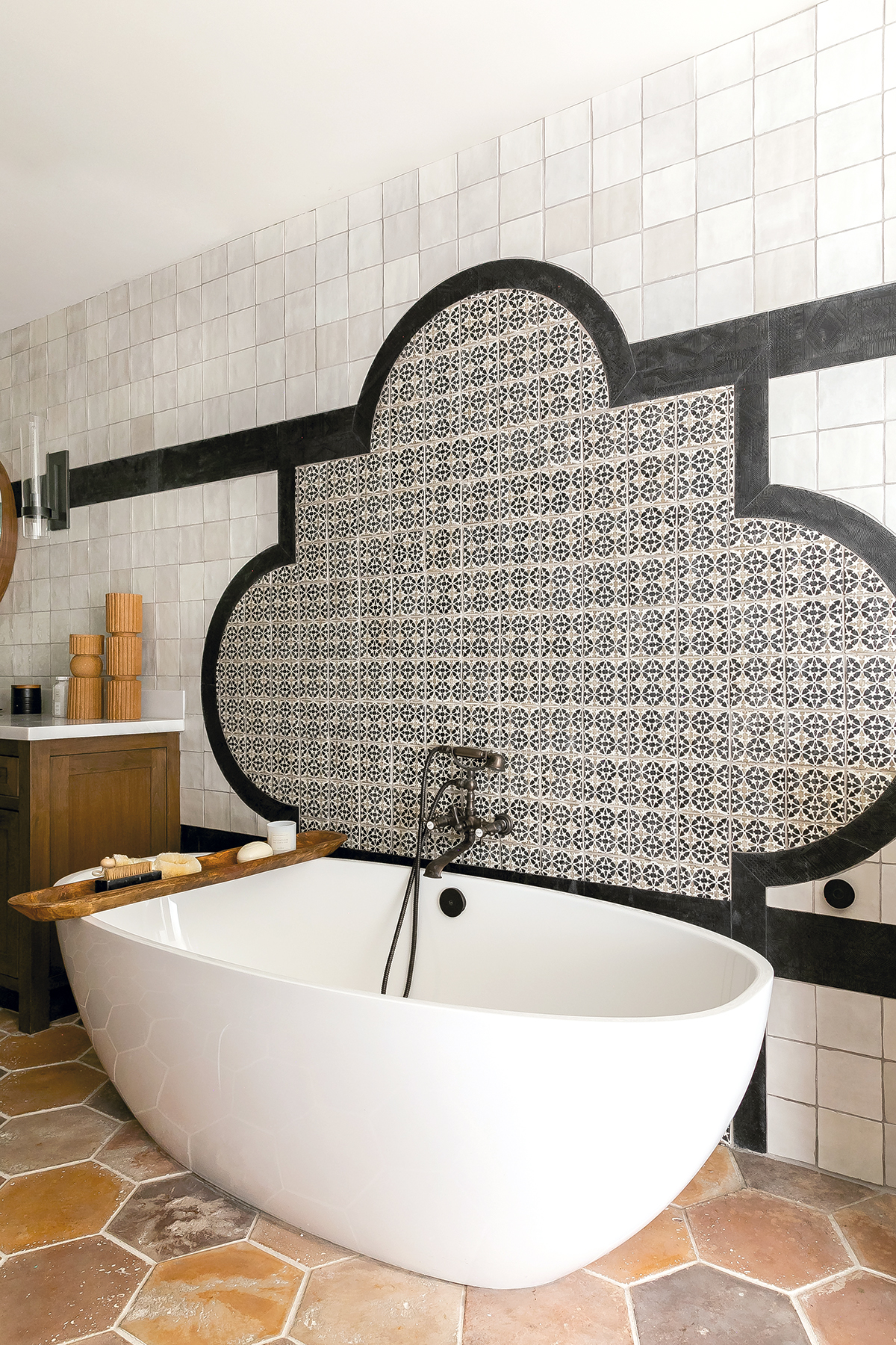

“Morocco is known for its intricate tile work,” says Lindsay Stokes Kennedy. “Its handcrafted, hand-painted tile has such character with an aged look. It’s what really motivated the project.”
Inspiration also resonated from vibrant, hand-painted, Spanish-style tiles found in other areas of the home, including the risers on the stairway.
“Those beautiful details encouraged us to keep the hand-painted tile theme going,” adds Alexandra Cole. “We loved the character that it adds, but in the primary bath we wanted the colors to be more muted. We wanted the same detail…just not as bold.”
As such, the design partners created a quatrefoil-shaped focal-point motif behind the freestanding tub. The interior is hand-painted terracotta tile from Ann Sacks’ Tiempo Series. The Bijan colorway, with Charcoal and Oxford on Silver, is framed with Black Tapis tile from the company’s Trattino Series.
“The trim tile is textured with a mudcloth pattern, which is a type of traditional African fabric,” notes Kennedy. “At a distance, it looks black, but as you get closer you see the details that are discreetly ingrained. It’s a small detail that really helped make the two tiles work together cohesively.”
The trim tile extends into the shower where it is contrasted with Ivory 5″x5″ glazed ceramic tile from Arizona Tile’s Flash Series.
“I like the blend of highs and lows,” says Cole. “We wanted to keep the walls simple and classic so the beautiful quatrefoil design and textured tile come through.”
The designers also gave thoughtful consideration to the shower floor, which is comprised of Nero porcelain micro mosaic tile from Ann Sacks’ Salluto Series.
“A lot of our clients want showers that feel therapeutic…that focus on recovery and restoration,” says Kennedy. “These clients wanted a steam shower and they want to spend a lot of time in it so we really thought about how it feels when they stand on the floor, especially for a long time. The micro mosaic tile is very spa-like. It gives them the essence of being away.
“We love how tile is so complex…and simple,” she continues. “It’s more than just pretty and soothing colors. It also has the ability to change your mood and how you live in the space. It makes one of the largest impacts in a bathroom, in both form and function.” 
The post Spring Bath Report: Transformational Tile appeared first on Kitchen & Bath Design News.