
I received a distressed note from a reader recently that I wanted to share with you all because when your paint colour looks wrong, the light continues to be your favourite scapegoat. Despite feeling like I sound like a broken record, I’ll say it again for the folks in the back:
It’s hardly ever the light that turned your paint colour against you.
Sorry, but the magical mysteries of light are not to blame for every colour mishap. And because I love you and want to free you from this disempowering belief, here’s the real reason your wall colour looks wrong.

But first, here is her note:
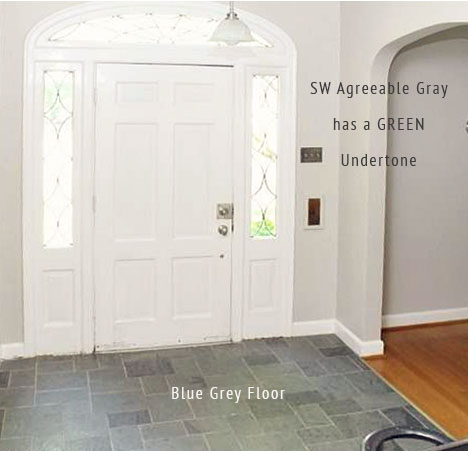
I bought a new house last year. The previous owner had the entire interior painted the same colors. Sadly left no paint cans but the closest match is Agreeable Gray on EVERY wall and White Dove on trim. In one sense this was a blessing because we could move right in and the colors were neutral enough that it didn’t grossly clash with our existing furniture. Now we are working to make the house more our own, which has involved a fair amount of painting.Here’s the question:I have an entryway/mudroom/hallway area that has two glass-paned doors at either end. One is northwest facing and the other is southeast facing (I’m in New England). There are also 3 recessed lights. The space is pretty narrow and not well suited to floor or table lamps. It’s more of a pass-through area. The flooring is a basic gray tile with a blue undertone.My problem is that the Agreeable Gray is such a chameleon. At some times of the day it seems to be compatible with the tile and at other times it completely clashes. I’m struggling to find an appropriate color that complements the tile all day long given the change in natural light. Is that even possible? We are not interested in changing the tile at this time. Perhaps I should just get some bold paintings to distract myself!
Here’s the thing, it’s not a trick of the light.
Why does my wall colour look wrong?
The real reason your wall colour looks green is because it has a GREEN undertone. If you want it to relate perfectly to the tile, you’ll need a grey with a BLUE undertone. What you are seeing when the light is bright and direct is the true colour. Sherwin-Williams Agreeable Gray is a green grey. And when the space is brightly lit, that’s when you can see that the floor is blue grey and the walls are green grey.
It’s really that simple. And it’s the essence of my system for Understanding Undertones®.
Sure, there are some relatively rare exceptions related to problems with strong reflections. But, whenever someone says to me, “Maria, the light changed my colour to pink [or blue, or green or purple]!” Well, it’s not the light and nearly always because they chose the wrong undertone. And when you combine the wrong undertone with other neutrals in their space, the colour will look too pink, or blue, or green, etc.
Why does this happen? Because the subtle undertones of neutrals are just that, SUBTLE. So in order to get them right, you need a method or a process that works. Lucky for you, I’ve already created it.
How do you choose the right neutral?
The best way to choose neutrals accurately is to:
1. Learn my System for Specifying Colour and Understanding Undertones. Instead of the overwhelming world of neutrals and whites, you’ll be equipped with only the most useful paint colours broken down into a digestible and functional range that includes the 5 undertones of beige, taupe, and 3 undertones of grey. I recommend that you read my ebooks for an excellent introduction into my system and a list of my most useful colours, neutrals and whites.
And then, if you want to start your journey to colour mastery (aka know precisely how to distinguish complex neutral undertones and know how to make the right colour choices) sign up for one of my Virtual Specify Colour with Confidence workshops.
2. Learn how to properly test and compare colour. Comparison is the key to getting colour right. And, in order to get to the level of accuracy required for the subtleties of undertones, proper testing is required. Again, we will spend extensive time learning (with several hands-on exercises) how to test and compare colour in my Virtual Specify Colour with Confidence workshop.
Because without this knowledge, you are just guessing and stuck blaming the light when you don’t get it quite right.
It doesn’t need to be this way. I was once in your shoes, guessing (stressing) and hoping to get the colour right. And, that’s what I want to save you from. I created my system with step-by-step processes so I could work smarter – and ultimately make better colour choices. You can learn these steps too and apply them to decisions about colour for any project.
What’s the right neutral for this room?
All that said, a pale green grey like Agreeable Gray is a nice, versatile backdrop for decorating as my reader noted. And technically, blue grey and green grey can play well together.
In this current trend for warmer, but fresher, kitchens you see pale green grey cabinets with blue grey carrara marble countertops everywhere. In this kitchen below, it’s the beautiful details and styling that really make it pretty. You don’t notice the relationship between the two different undertones of grey when there are so many decorating accents and details that pull this room together.
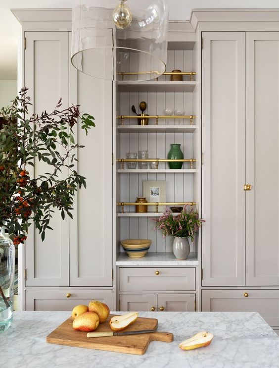
Green grey and marble kitchen by @heigicaillierdesign
What’s the easiest way to fix my wall colour?
The problem when you are looking at a space with nothing in it is that your eye isn’t satisfied. In a blank, unstyled room you are only going to notice the stark relationship between two slightly different neutrals. Those competing neutrals are the only thing you see. But your eye, on the other hand, desires complete harmony between those colours. It’s a one-two relationship that isn’t perfect yet.
But, you can easily create some serious magic with decorating and details. Suddenly, your eye has more interesting things to focus on in the room. And that means you are longer cranky that your neutrals aren’t spot on.
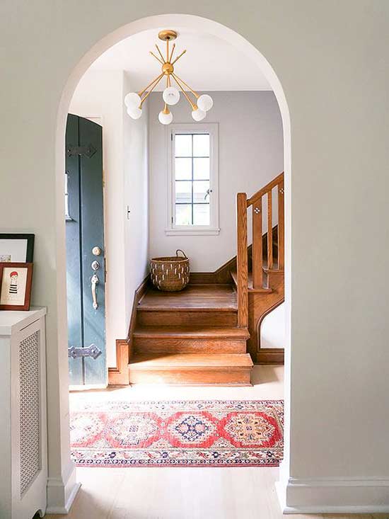
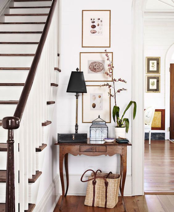
You can see in this foyer below that the blue grey floor tile doesn’t perfectly relate to the green grey walls. However, the pretty hardware, lighting and styling distract us nicely from that mismatch of undertones.
This mismatch of grey undertones happened constantly all throughout the grey trend. And the ones that got away with it are invariably the ones who are excellent decorators and stylists. Remember, magazine-worthy designs cannot be easily replicated.
So my reader is absolutely right. She should put up some artwork, a pretty rug and create some magic to distract herself. Because if she is just getting to know the house and getting settled, overall the paint is inoffensive with her furnishings. It’s a much better solution to get busy decorating than to begin repainting the whole house. Would you agree?
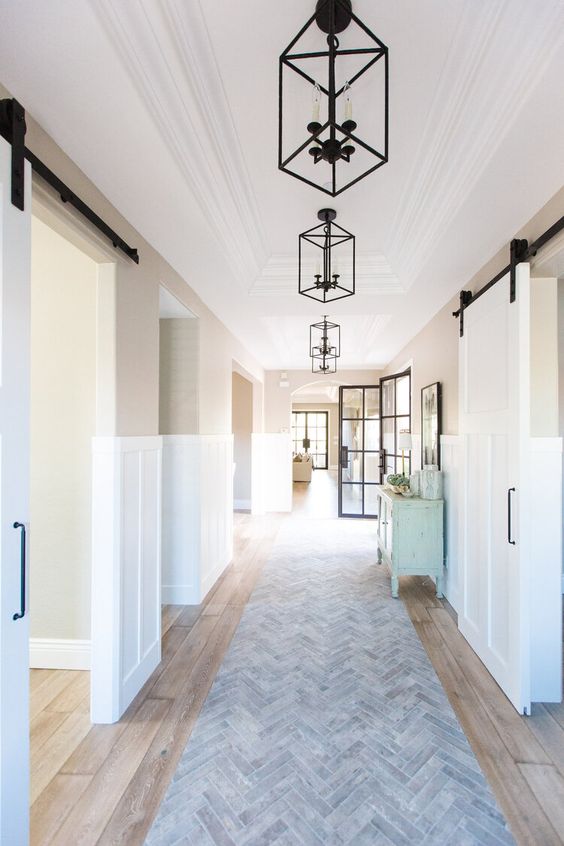
A pretty runner rug is a great way to add colour, pattern and interest to a slim passageway. Mirrors, artwork, and sconces are great style additions too. Focus on the details and colour of the doors themselves and look for ways to draw the eye through openings by creating interesting focal points directly across in the next room. Need a little help shopping for home decor? Try this.
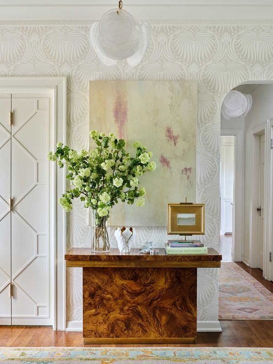
You don’t need a lot of space to add a small vignette. Consider hanging an intriguing piece of artwork over a small console at the end of the hall to draw the eye back.
Passageways or entryways, with their limited space for decorating, are also great places to add interest with patterned wallpaper.
So, again, unless you have a rare reflection situation, your unhappy wall colour is rarely the fault of the light. And even if the paint colour is doing something unexpected, the best fix is to get busy decorating immediately! Doesn’t that sound more fun than repainting?
To get customized help choosing a paint colour for your home, buy my eDesign services here.
Related Posts:
The post The Real Reason Your Wall Colour Looks Wrong appeared first on Maria Killam | Timeless Colour.