
As designers know, there are a lot of decisions to be made when planning a kitchen. Those related to surfaces, such as backsplashes and countertops, are dependent on each other. Sometimes it’s the backsplash that takes precedent; other times it’s the countertop.
Regardless of which comes first, the duo routinely works together to create cohesive designs that look beautiful and function as well.
This month, Kitchen & Bath Design News asked designers to share projects that highlight backsplash and countertop duos that showcase beautiful balance.
Dawn Ianno, senior designer
Annette Jaffe Interiors; Port Washington, NY
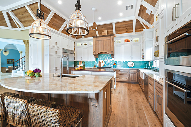
To accommodate this family of five, three of which are young children, Dawn Ianno selected surfacing materials that would stand up to heavy daily use. As such, she chose to combine stainless steel tile for the multiple backsplashes with quartz for the countertop surfaces for the double islands as well as the perimeter cabinetry.
“They are a laid-back family and they wanted finishes that were easy to clean,” she says.
Stainless steel is often a material of choice in commercial restaurant settings because of its durability and minimal-maintenance attributes for both countertops and backsplashes, which makes it a logical surface selection for this family, as well. While sheets and panels are commonly used, Ianno opted for subway-style tile for this kitchen, laid in a brick pattern, to give the metal a completely different vibe while maintaining its industrial undertones.
The metal’s reflective finish also perfectly aligns with the high-gloss finish of the navy upper cabinets. Ianno designed those that flank the ventilation hood with glass doors, which further showcase glimpses of the stainless steel.
These days, quartz is often the material of choice for many of Ianno’s clients, who enjoy it in part for the same reasons as stainless steel…durability and low maintenance. Many opt for colors that offer a bit of veining pattern to resemble natural stone such as marble. However, the pure white colorway of Silestone’s Blanco Zeus from Cosentino maintains a neutrality that works for a variety of design styles, including the contemporary beach vibe – characterized by the pendant lights crafted from natural materials – mixed with a bit of industrial undertones found in this kitchen.
Adding a waterfall edge detail to the prep island, which offers abundant storage and an oversized sink with dual faucets, creates interest while including an ample overhang on each side of the outer island provides enough in-kitchen seating for the entire family, plus a guest.
“Originally, this home had a formal dining room,” says the designer, “but my clients preferred a more informal approach, turning that space into a den. Including seating at the island as well as at a small table adjacent to the kitchen accommodates their family.”

Backsplashes typically make a more prominent visual impact in Alisha Gwen’s designs because they are what the eye sees first. Such was the case in this kitchen, where the hand-painted tile boldly takes center stage, with its two-tone colorway matching the colors used throughout the kitchen. The more subdued quartz countertop was not only sourced to give the backsplash the opportunity to stand out, but it also offers Gwen’s clients a maintenance-free worktop.
Photos: Dave Bryce
Alisha Gwen, principal designer
Alisha Gwen Interior Design; Pittsburgh, PA
Alisha Gwen often chooses a backsplash before the countertop for her kitchen projects, in part because she is usually focused on a specific color or pattern where the former’s options can be limited.
“I chose the more limited option first, knowing there is a wide range of countertop materials that will blend with the backsplash selection,” she explains.
Backsplashes also typically make a more prominent visual impact in her designs because they are what the eye sees first, she indicates. Such was the case in this kitchen, where the Pratt + Larson Scraffito Polywash Mushroom hand painted tile boldly takes center stage as the backsplash for multiple walls throughout the kitchen.
“This client requested a timeless, neutral kitchen with a visual pop,” she explains. “The kitchen is small, so I wanted to create the illusion that it was larger by introducing a bold pattern for the backsplash that would also provide maximum visual interest and impact for the small space.”
The tile’s two-tone colorway also matches the colors used throughout the kitchen, including the stained wood ventilation hood, floating shelves and island cabinetry as well as the white cabinetry and quartz countertops.
“We knew we were going to include white cabinets,” says Gwen, “so we chose to elevate them by adding a contrasting, dark, wood-stained island and hood. We brought the design full circle by incorporating both colors in the backsplash.”
The more subdued Silestone Blanco Orion quartz countertop from Cosentino was not only sourced to give the backsplash the opportunity to stand out, but it also offers Gwen’s clients a maintenance-free worktop.
“Quartz is my ‘go-to’ countertop for many clients because so many of them have busy lifestyles and young children, including this family,” she notes. “While I love using marble, the reality is that most families don’t have the time or energy to maintain it, so quartz – including patterns that mimic marble – is a great option because it’s basically a no-maintenance material.”
Nicole Whitehorn’s client based her kitchen renovation on the high-gloss, beachy blue/green glass tile that serves as the backsplash. To add a bit of interest, the designer laid the tile in two different patterns, including a traditional brick pattern beneath the upper cabinets and sink windows and a framed herringbone pattern behind the cooktop. To reinforce her client’s desired beach/coastal theme, Whitehorn specified a sandy-colored quartzite as the perimeter and outer island countertops.
Photos: Josh Quick
Nicole Whitehorn, interior designer
Waterview Kitchens; Tequesta, FL
Many of Nicole Whitehorn’s clients select their countertops before the backsplash. Currently, a lot of them are leaning towards heavily veined quartzite to make a statement for the island, complemented with a more neutral, ‘quieter’ backsplash that lets the natural stone be the focal point.
However, this client switched it up and based her entire kitchen renovation on the Pure Honeydew high-gloss glass
tile that serves as the backsplash.
“The tile was her first love,” says Whitehorn. “She came to us with it already selected, so we based all the other finishes around it.”
To add a bit of interest, the designer laid the tile in two different patterns, including a traditional brick pattern beneath the upper cabinets and sink windows and a framed herringbone pattern behind the cooktop.
“The backsplash is a smaller element compared to everything else in the kitchen, such as the dramatic wood ventilation hood with corbels and anchor appliques,” she explains. “We felt we needed something to draw attention to the area above the cooktop. My client didn’t want to mix in any other tile, so we thought a pattern change would be the perfect solution.”
The tile’s classic beachy blue/green hue was also carried to several other areas in the space, including as the interior color for the open plate display cabinets and multiple glass door cabinets.
To reinforce her client’s desired beach/coastal theme, Whitehorn specified Perla Venata quartzite as the perimeter and outer island countertops. To increase seating capacity in the kitchen, she also designed the island with a sweeping, curved outer edge that allows for multiple people to gather.
“The quartzite is a perfect sandy color,” she says. “My client wanted something neutral, something that would essentially fade into the background, so the focus could be on the tile. Quartzite is a popular countertop choice currently because it’s so dense…and beautiful. And even though this particular slab doesn’t have a lot of bold veining like some other ones do, it has a lot of depth and is dramatic, without taking away from the backsplash.”
Since Whitehorn expanded the kitchen’s footprint, she was able to include a second island, which she topped with walnut butcher block. Located in close proximity to the refrigerator, cooktop and sink, it serves as a main workstation for prepping/chopping food and for making pizzas, the latter of which is a popular and much-loved family event.
“While they love the natural stone, they prefer wood for chopping and rolling out dough,” she explains, adding that the wood also complements the hickory cabinetry and ventilation hood as well as the white oak flooring and ceiling inserts.

In this kitchen, designed by Tina Montemayor, the handmade green subway tile backsplash and marble island countertop each have their own focal-point moments. Green is the
homeowner’s favorite color, and the tones in the kitchen also pay tribute to the lush greenery outside. As for the marble, hints of beige also acknowledge the wood, both inside and outside, while its more prominent black and grey veins provide drama.
Photo: Chris Hacker
Tina Montemayor,
owner/principal designer
Tina Montemayor Design; Oakland, CA
In many kitchens, it’s a case of either, or – either it’s the countertop or the backsplash that speaks the loudest. However, in this kitchen, they both have a relatively strong voice, with the honed Calacatta Black Vein marble island countertop and the handmade Evergreen Fireclay subway tile backsplash each having its own focal-point moment.
“In every kitchen we design, we consider the sequencing of how people experience a house and how they look at certain design elements from different elevations and from different distances,” says Tina Montemayor. “We are really mindful of having a focal point in each direction. For this kitchen, the island is visible from the entryway of the home, so we felt it was the perfect place to incorporate a waterfall countertop with a dramatic veining pattern. Conversely, the bold tile backsplash is the focus from the island forward.”
Laying the 2″x6″ subway tile in a stacked pattern was also purposeful, creating a more contemporary vibe compared to a more traditional staggered brick pattern.
“The kitchen is also small, so we wanted it to feel as wide as possible,” she explains. “Stacking the tile – rather than laying it vertically, which is also trendy right now – visually ‘pulls’ out the kitchen, rather than ‘pulling’ it up.”
Color played a role in each material’s selection, as well. Since green is the homeowner’s favorite color, it seemed a logical choice for the backsplash. It also pays tribute to the lush greenery outside.
“We wanted to tie the kitchen to the outdoors, yet make it feel glamorous,” she adds. “There’s a lot of wood in the house, on the floor and the ceiling, as well as the wood in the trees that are visible through the floor-to-ceiling windows in the adjacent room. The homeowners felt there was a need for elements that were more lux and chic rather than treehouse and rugged.”
As for the marble, hints of beige also acknowledge the wood, both inside and outside, while its more prominent black and gray veins provide drama, especially as a waterfall-edge detail.
“The veins are positioned to welcome visitors from the walkway, like a river current that draws you in,” she says.
The dark veins also coordinate with the Nero Marquina marble that tops the perimeter base cabinetry.
“People don’t traditionally use Nero Marquina as a kitchen countertop because it is so porous and is susceptible to etching and stains,” notes the designer. “It can also fade from the sun. But after looking at the lighting in the kitchen, fading won’t be a huge problem. And, after considering alternatives, the homeowners wanted to stick with the marble and they are very happy with the selection.
“There is no shortage of materials, colors and patterns for backsplashes and countertops,” Montemayor continues. “In choosing between them, it is important to understand how the client wants to live and function in the kitchen. You can achieve high-end looks with materials that have less upkeep than marble, but there’s something about natural elements that offers an organic, here-to-stay look that can’t be replicated. The clients who appreciate natural elements are the ones who are okay with the wear and tear and upkeep that comes along with them.
“I do feel like marble will continue to hold strong,” she adds. “People appreciate it as a luxury item. And although ‘marble fatigue’ is a thing, people still look for opportunities to bring the outdoors in. As the world starts opening up, there will be a shift towards creating a sanctuary feel that can arguably come from natural materials. To put a twist on bold marble veining and the traditional black, white and gray colors, designers will be looking for softer, toned-down neutrals in unique colors.”

Cement tiles are a popular material choice for Katie Dryden’s clientele right now, but these homeowners took that trend a step further, desiring a less predictable pattern in their remodeled kitchen. Dryden experimented with a variety of tile orientations for the 4″x4″ tile to create a unique pattern. Its randomness also makes the backsplash feel more special, and, in some ways, more timeless. As a complement, she chose quartz for the perimeter and the island countertops.
Photo: Petra Ford
Katie Dryden, owner/designer
Hence Interiors; Chicago, IL
Cement tiles are a popular material choice for Katie Dryden’s clientele right now. While these homeowners may be part of that current trend, they didn’t necessarily want to play it too safe with an expected, predictable pattern choice as the backsplash for their remodeled kitchen.
“They wanted something interesting and unlike what everyone else was doing,” says the designer. “My clients were inspired by a kitchen they had seen on a British television show, so we took it from there, but we created our own playful version.”
The homeowners also wanted something that coordinated with the modern vibes of the rest of the house, which had been remodeled with a new addition to accommodate a dining room.
“The kitchen is actually in a little niche with a ceiling that is lower than the existing structure,” she says. “It was nice to be able to play with this little pocket with a fun backsplash as well as lighting.”
The two-tone 4″x4″ Zia Tile Delta Midnight cement tile is split in half, corner to corner, creating two equally sized triangles within each square. To accommodate her client’s wish for the unusual, Dryden experimented with a variety of tile orientations to create a unique pattern.
“I drew it in many, many different ways, including keeping them all the same direction and mixing it up with irregularities,” she says. “In the end, we chose an irregular pattern and mapped it all out for our tile layer to take out the guesswork. The randomness of the pattern also makes it more special, and, in some ways, keeps it timeless. Plus, it makes for a great selfie backdrop! My clients love taking pictures of themselves using their kitchen. It’s a very happy place.”
To also showcase the ‘art,’ Dryden eliminated some of the upper cabinets and replaced them with floating wood shelves.
“We maintained the window, but we wanted to have a big piece of the backsplash showing, rather than covering it up with cabinets. Keeping that wall somewhat open gave us a way to display the ‘art.’ Bringing in natural wood is a nice feature, too.”
As a complement, Dryden chose quartz as the countertop for the perimeter and the island, the latter which features base cabinetry painted in a matching hue to the dark color in the backsplash.
“This quartz has a marble look to it with just a bit of veining…nothing that is too ‘active’ to take away from the backsplash,” she explains, adding that its durability is also an important consideration for the young family. “We wanted something that was white and clean, pretty and functional.” 
The post Stylin’ Surfaces appeared first on Kitchen & Bath Design News.